

Anywho, haven't even started THIS post yet.

I think color is super, uber important. Every artist, no matter what your medium, should have a color wheel.
It makes your life easier and eventually you'll be able to go without it.
Colors on the opposite of the color wheel is called "complementary" for a reason. Those colors show the best in each other. Even the muted tones, I tend to grab colors that are opposite each other.
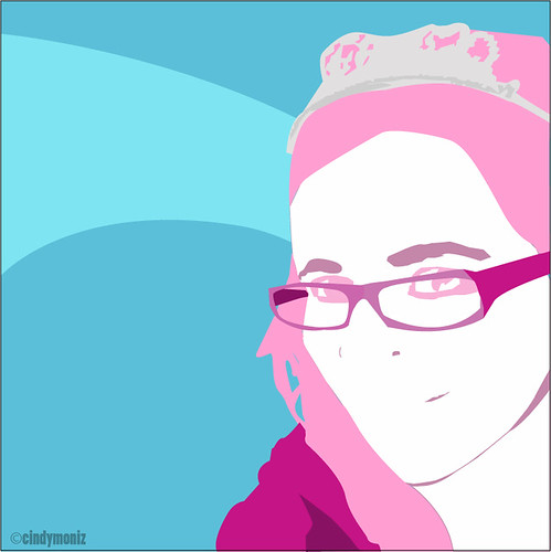
Mixing cool colors with warm can really tone done the warm colors. In the picture to the left, if I had gone with a yellow background (i like yellow), the project as a whole would not come across the way that it does. There really wouldn't be a calming effect, at all. Which is what I wanted.
Pretty self explanatory, but I like talking about it. Yay, color! Three cheers for color! Hooray! Hooray! Hooray!
.......
Ignore me.

I've been on a blogging spree this week! I mean, every day so far! Not to shabby, huh?
Off to send out more resumes. Peace.
Be Creative!
Cindy
No comments:
Post a Comment